

通过阅读此文,你可以快速了解小程序中自定义组件的使用方法
前置学习 WIP
在正式学习本文前,请确保你已经安装了命令行工具,并对使用命令行工具开发自定义组件有一定的了解,推荐先按顺序阅读以下文档:
- 低代码快速上手
功能简介
与桌面端类似,当平台侧提供的基础组件不满足当前需求时,可以使用自定义组件来扩展平台组件。
目前小程序的自定义组件支持两种:
- 页面自定义组件:用于提供给页面搭建人员在搭建页面时使用
- 高级表单:重写操作中的表单,替换掉操作中的表单(目前仅支持重写操作自带的表单)
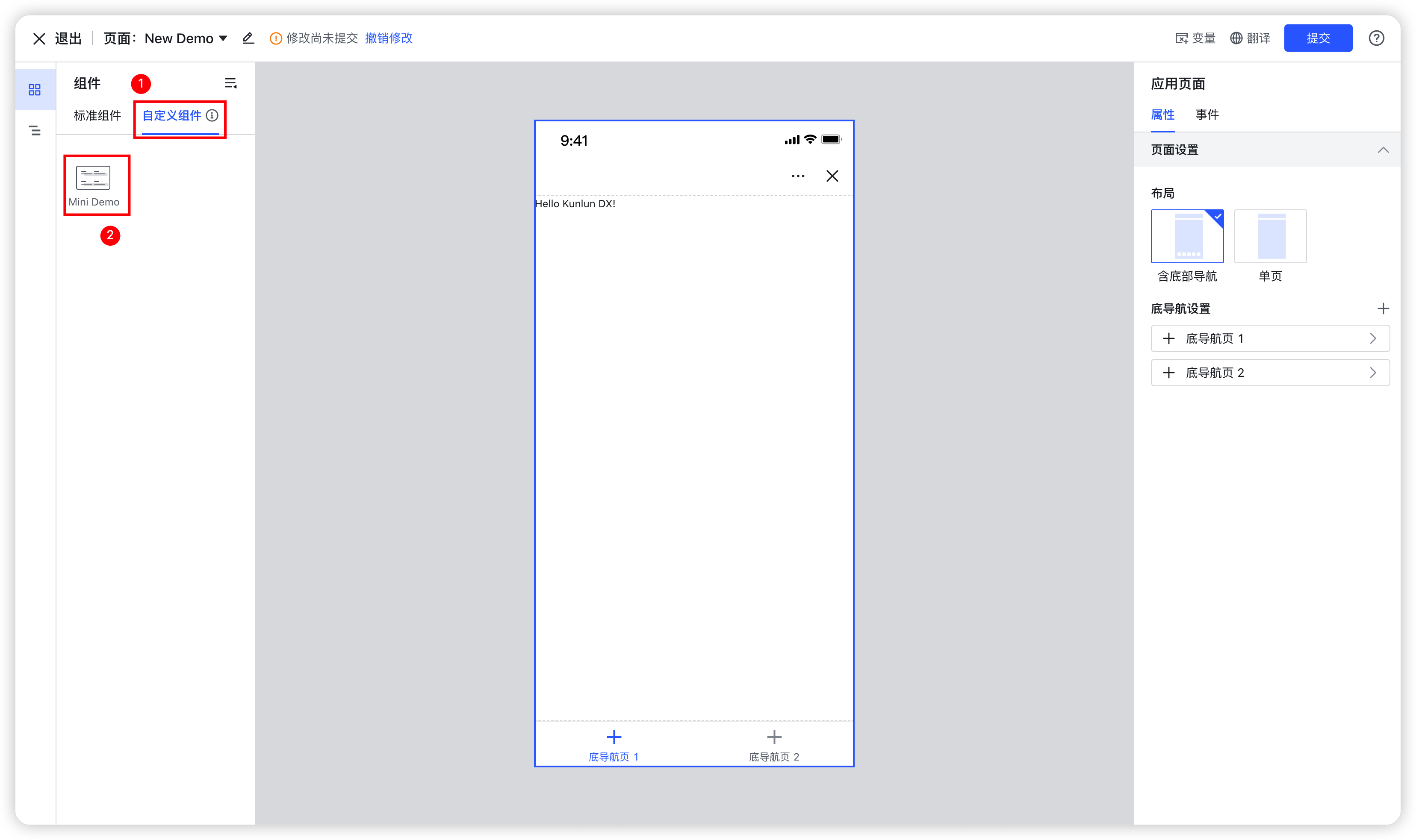
页面自定义组件
设计态
250px|700px|reset
运行态
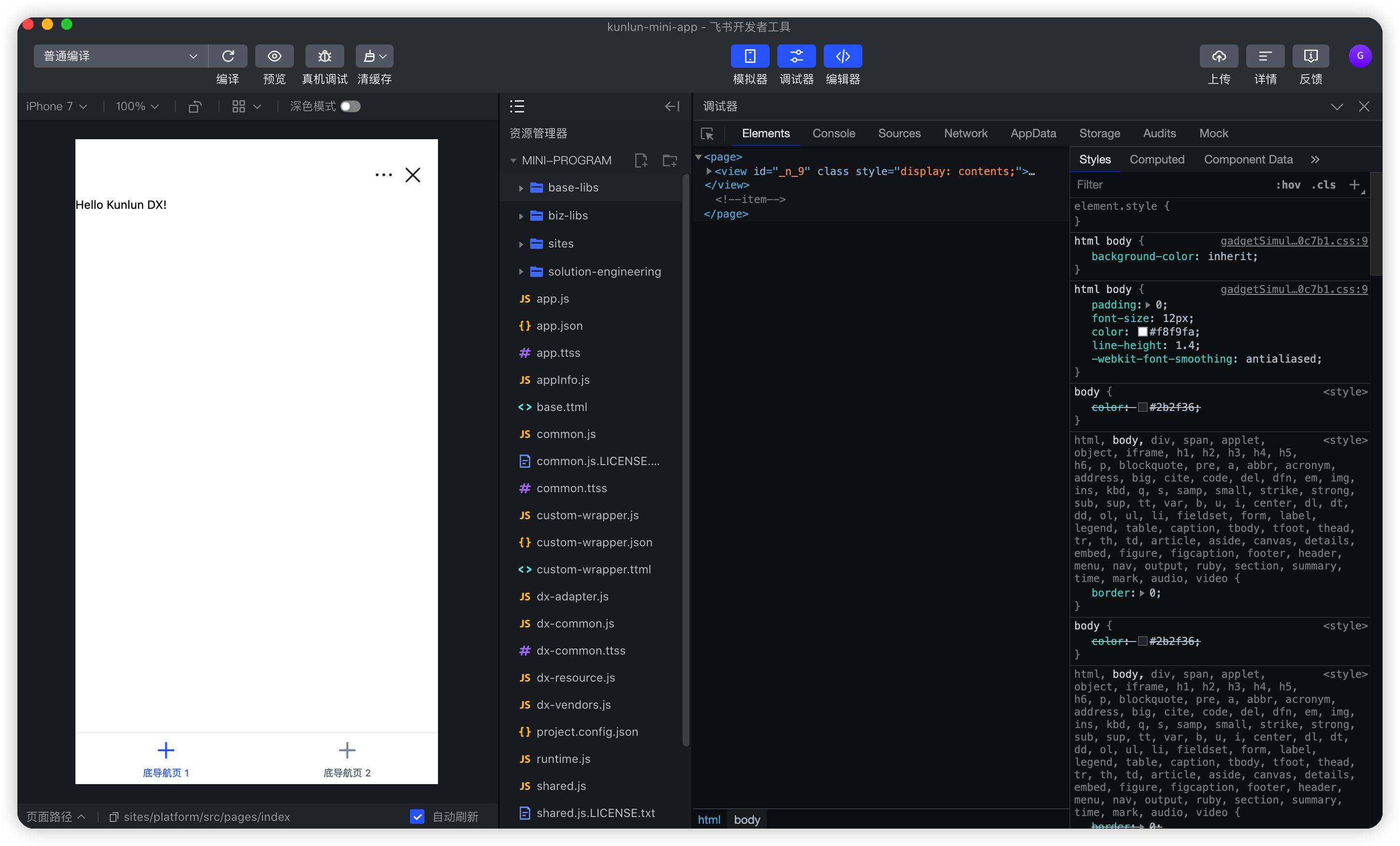
250px|700px|reset
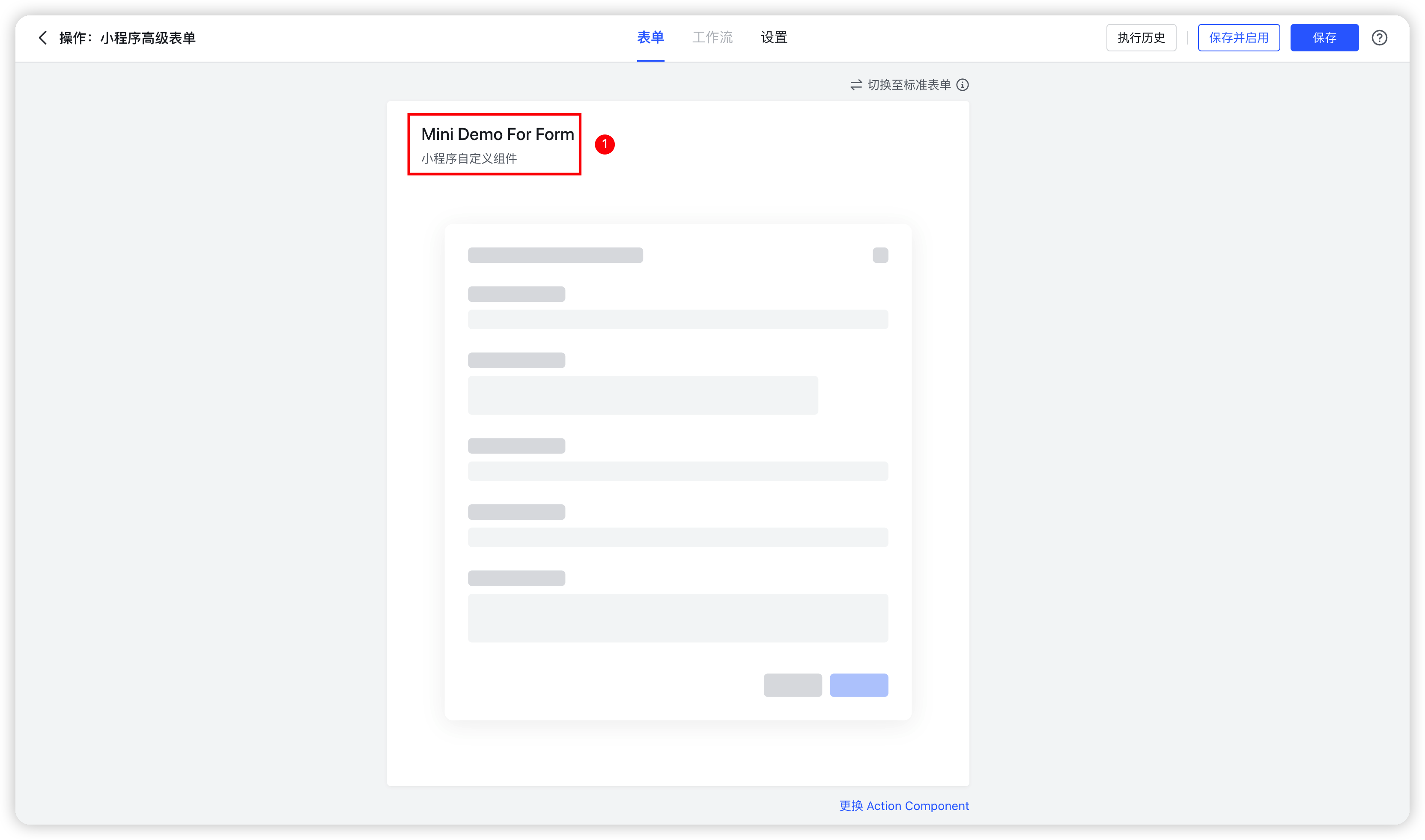
高级表单
250px|700px|reset
适用场景
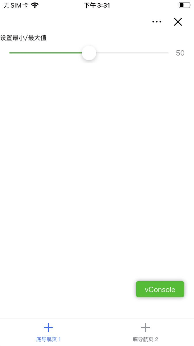
自定义进度条组件
- 需求:定义一个进度条组件
- 代码示例:
import { View, Text, Slider } from '@tarojs/components';
export default function MiniDemo(props: unknown): JSX.Element {
return (
<View>
<Text>设置最小/最大值</Text>
<Slider step={1} value={50} showValue min={0} max={100} />
</View>
)
}
- 效果图:
250px|700px|reset
高级表单中展示视频
- 需求:定义一个包含视频的表单项的表单
- 代码示例:
import { View, Video, Text } from '@tarojs/components';
export interface MiniDemoForFormProps { }
export default function MiniDemoForForm(props: MiniDemoForFormProps): JSX.Element {
return (
<View>
<Text>平常心做非常事</Text>
<Video
objectFit="cover"
controls={false}
style={{ width: "100%" }}
/>
</View>
)
}
MiniDemoForForm.title = "Video demo"
- 效果图:

250px|700px|reset
功能说明
自定义组件
应用场景为应用搭建中的移动端页面
文件结构
.components
├── MyDemo
│ ├── configPanel //属性面板的文件夹
│ │ └── index.mini.ts
│ ├── index.meta.json //自定义组件的元信息文件
│ └── index.mini.tsx //组件的入口文件
└── package.json
- index.meta.json
index.meta.json 是自定义组件的元信息文件,可通过该文件设置自定义组件的「API name」、「名称」、「描述」、「展示图标」和「使用场景」。其示例如下:
{
"apiName": "MyDemo", //组件的 API 名称,组件唯一标识,不可重复
"label": "My Demo", //组件的名称,会显示在页面编辑器中
"description": "component's description", //组件的描述
"icon": "./assets/icon.svg", //组件图标,会显示在页面编辑器中
"targets": {
"scenes": ["Page"] //组件使用场景:Page-页面自定义组件;Form-高级表单
}
}
- apiName: 组件的 API 名称,组件唯一标识,不可重复
- abel:组件的文本,支持多语,多语类型与示例如下:
// 类型
{
zh_CN: string;
en_US: string;
}
// 多语示例
{
zh_CN: "这是组件的名称",
en_US: "this is the component name",
}
- description: 组件的描述,支持多语;
- icon: 组件展示图标,使用相对于 index.meta.json 的相对路径;
- targets: 该组件的使用场景,该对象下有一个 scenes 字段,其值是一个数组,默认为 Page,即在页面中使用。如果应用场景为 Form,元素中的值需要添加 Form,即 scenes:["Page", "Form"] 。
- index.mini.tsx
小程序组件入口,后缀为 mini.tsx,同时支持 mini.jsx
- configPanel
属性面板配置目录,与属性面板相关的配置都可以放在此目录,其入口为 index.mini.ts
函数组件
仅在 @kunlun-dx/sdk 0.9 及以上版本适用
函数组件示例如下:
import React, { useState } from "react";
import { View, Button } from '@tarojs/components';
export interface MyDemoProps {}
export default function MyDemo(props: MyDemoProps): JSX.Element {
const [count, setCount] = useState(0);
const handleIncrement = () => {
setCount(count => count + 1);
}
const handleDecrement = () => {
setCount(count => count - 1);
}
return (
<>
<View>the result is {count}</View>
<Button onClick={handleIncrement} type="primary">+1</Button>
<Button onClick={handleDecrement} type="primary">-1</Button>
</>
)
}
属性面板
仅在 @kunlun-dx/sdk 0.8.15 及以上版本适用
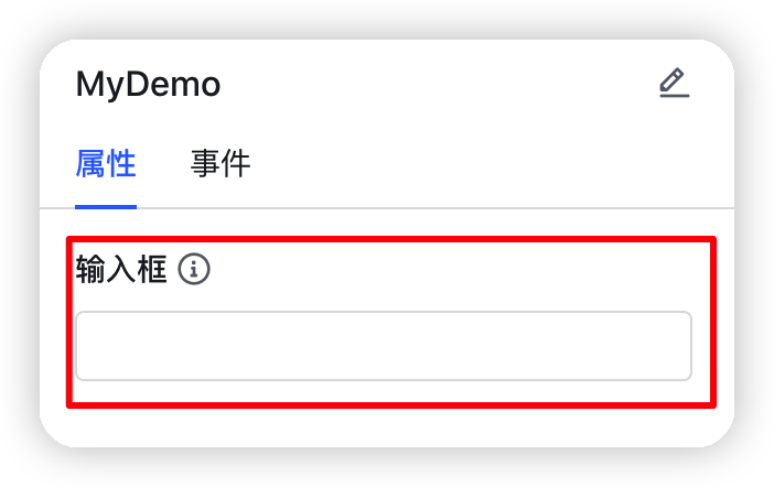
如需将自定义组件的属性及事件暴露在 Builder 面板区供搭建者配置,提高组件的灵活性与可复用性,可以定义该自定义组件的属性面板,示例如下:
import { PropertyConfig, PropertyType, ActionType } from '@kunlun-dx/component';
const propertyConfig: PropertyConfig = {
propertySettings: {
properties: [{
type: PropertyType.String,
key: "input",
label: {
zh_CN: "输入框",
en_US: "input"
},
tooltip: {
zh_CN: "提示信息",
en_US: "tooltip infomation"
},
validator: (value: string) => {
if ((value || '').length >= 20) {
return {
result: false,
errorMsg: {
zh_CN: "不允许超过 100 个字符",
en_US: "More than 100 characters are not allowed",
}
}
}
return {
result: true
};
}
}],
propertyGroups: []
},
eventSettings: []
}
export default propertyConfig;
属性面板定义的属性的值,会在组件的属性中体现。上述代码的效果如下:
250px|700px|reset
使用第三方组件
配置使用第三方组件需要在组件目录下的 index.meta.json 配置第三方组件的入口,如下所示:
{
"icon": "./assets/icon.svg",
"apiName": "MyDemo",
"label": "custom componets's label",
"description": "beautiful rainbow",
"targets": {
"scenes": ["Page"]
},
"mini": {
"usingComponents": {
// 相对于 index.meta.json 的路径
"rich-editor": "./rich-editor/index"
}
}
}
其中组件文件结构如下所示:
.MyDemo
├── assets
│ └── icon.svg
├── configPanel
│ └── index.ts
├── index.meta.json
├── index.mini.tsx
└── rich-editor
├── index.js
├── index.json
├── index.ttml
└── index.ttss
组件中使用如下:
import { View } from "@tarojs/components";
export default function MiniDemo(props: unknown): JSX.Element {
return (
<View>
<rich-editor
readonly
autoHeight={true}
contents={{ html: `<h1>hello, DX!!!</h1>` }}
/>
</View>
);
}
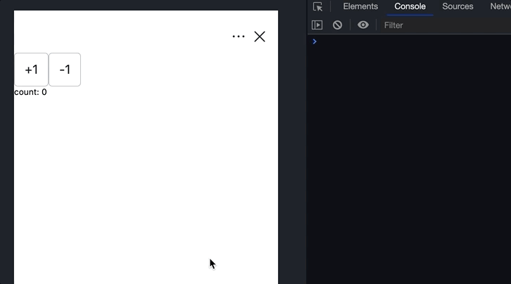
组件间通信
如果两个组件在同一个页面,即页面内的组件,可以使用页面变量进行通信,如下所示:
在同一个页面自定义组件中,可以通过监听页面变量的变化来达到页面通信的目的,例如,组件 A 触发页面变量的变化,组件 B 中监听,然后执行相应的回调,示例如下:
- 组件 A
需要在平台侧的编辑器中定义页面变量 count
import { useRuntimeContext } from '@kunlun-dx/component';
export default function ComponentA(props: unknown): JSX.Element {
const context = useRuntimeContext();
const count = context?.page?.pageVars?.count ?? 0;
const handleSetPageVar = (value: number) => {
context?.page?.setPageVar<number>('count', value);
}
return (
<div>
<button onClick={() => handleSetPageVar(count + 1)}>+1</button>
<button onClick={() => handleSetPageVar(count - 1)}>-1</button>
</div>
);
}
- 组件 B
import { useEffect } from 'react';
import { useRuntimeContext } from '@kunlun-dx/component';
export default function ComponenetB(props: unknown): JSX.Element {
const context = useRuntimeContext();
const count = context?.page?.pageVars?.count ?? 0;
useEffect(() => {
// TODO:
console.log('callback', count);
}, [count]);
return (
<span>count: {count}</span>
);
}
- 效果如下:
250px|700px|reset
组件中内置 API
可以通过调用全局对象 tt 上的方法来调用相关的 API,示例如下:
// 获取设备信息
const systemInfo = getSystemInfoSync();
// 显示全局提示信息
tt.showToast({
title: 'toast message',
icon: 'success',
duration: 1500
});
import Taro from '@tarojs/taro';
// 获取当前页面栈
Taro.getCurrentPages();
组件中使用样式
组件样式支持 CSS、Less、CSS Module 等,为避免样式造成全局污染的风险,推荐使用 CSS Module 来定义样式,示例如下:
- index.module.less:
@blue: #3370ff;
.custom-text {
color: @blue;
}
index.mini.tsx:
import { View, Text } from "@tarojs/components";
import styles from './index.module.less';
export default function MiniDemo(props: unknown): JSX.Element {
return (
<View>
<Text className={styles["custom-text"]}>text content!!</Text>
</View>
);
}
CSS 使用示例:
import { View, Text } from '@tarojs/components';
const textStyles: React.CSSProperties = {
color: "#3370ff",
} as const;
export default function MiniFuncDemo(props: unknown): JSX.Element {
return (
<View>
<Text style={textStyles}>Hello Kunlun DX!</Text>
</View>
)
}
Less 使用示例:
import { View, Text } from '@tarojs/components';
import './index.style.less'
export default function MyDemo(props: unknown): JSX.Element {
return (
<View>
<Text style="custom-text">Hello Kunlun DX!</Text>
</View>
)
}
其中 index.style.less 内容如下:
@blue: #3370ff;
.custom-text {
color: @blue;
}
组件属性
可以通过获取类组件上的 meta 与 context,对应函数组件中的 useRuntimeContext() 与 useMeta() 来获取组件的上下文信息。获取示例:
类组件
import { View } from '@tarojs/components';
import { BaseComponent } from '@kunlun-dx/component';
export default class MyDemo extends BaseComponent {
render(): React.ReactNode {
const { context, meta } = this;
return (
<View>Hello Kunlun DX!</View>
);
}
}
函数组件
import { View } from '@tarojs/components';
import { useRuntimeContext, useMeta } from '@kunlun-dx/component';
export default function MyDemo(props: unknown): JSX.Element {
const context = useRuntimeContext();
const meta = useMeta();
return (
<View>Hello Kunlun DX!</View>
);
}
- meta
指的是组件的元数据信息,即 index.meta.json 中的信息,会对里面的多语与 icon 资源进行转换,多语转换为当前语言环境对应的文案,而自定义组件的 icon 则转换为实际的 CDN地址。
index.meta.json
{
apiName: "MyDemo",
description: "自定义组件示例",
icon: "./assetss/icon.svg",
label: {
zh_CN: "自定义组件的名称",
en_US: "custom components's name"
},
targets: {
scenes: ["Page"]
}
}
转换后:
{
apiName: "MyDemo",
description: "自定义组件示例",
label: "自定义组件的名称",
targets: {
scenes: [ "Page"]
}
}
- context
指的是组件的上下文信息,可以通过 context 中的属性中获取。context 信息示例如下
- context.tenant,当前租户信息
- context.currentUser,当前用户信息
- context.app,当前应用信息
- context.page,当前页面的信息
- context.previewing,当前组件处于设计态还是运行态页面中
类组件 BaseComponent
推荐使用 SDK 0.9 版本来书写函数组件
类组件需要继承 BaseComponent 基类,示例如下:
import { BaseComponent } from '@kunlun-dx/component';
import { View } from '@tarojs/components';
export default class MyDemo extends BaseComponent {
componentDidmount(): void {}
componentWillUnmount(): void {}
componentDidUpdate(): void {}
render(): React.ReactNode {
return (
<View>Hello Kunlun DX!</View>
);
}
}
类组件中的属性 meta 与 context 等上下文信息可以通过 this.meta 与 this.context 来获取。
高级表单
文件结构
高级表单的文件结构与自定义组件文件结构一致,可以参看上述自定义组件的文件结构。区别在于 index.meta.json 中 targets.scenes 值的指定,例如要将该自定义组件应用于高级表单场景,其值设置示例如下:
{
"apiName": "myDemo",
"description": "自定义组件示例",
"icon": "./assetss/icon.svg",
"label": "自定义组件的名称",
"targets": {
"scenes": ["Form"]
}
}
类组件中的属性 meta 与 context 等上下文信息可以通过 this.meta 与 this.context 来获取。
定义高级表单
高级表单中可以使用类组件来继承 BaseComponent 或者使用函数组件,分别如下:
函数组件
import { View } from '@tarojs/components';
export interface MiniDemoForFormProps { }
export default function MiniDemoForForm(props: MiniDemoForFormProps): JSX.Element {
return (
<View>Form Content</View>
)
}
函数组件
import { View } from '@tarojs/components';
import { BaseComponent } from '@kunlun-dx/component';
export interface MiniDemoForFormProps { }
export interface MiniDemoForFormState { }
export default class Demo extends BaseComponent<MiniDemoForFormProps, MiniDemoForFormState> {
render(): React.ReactNode {
return (
<View>Form Content</View>
);
}
}
获取表单上下文
与页面中的自定义组件的上下文基本类似,表单同样有 meta 与 context 等上下文信息,区别是表单中的 context 并无 page 属性,及无法消费页面变量。
设置表单标题
函数组件中,可以通过设置函数对象上的 title 属性来达到设置表单标题的目的,代码如下:
import { View } from '@tarojs/components';
export default function MiniDemoForForm(props: unknown): JSX.Element {
return (
<View>Form Content</View>
)
}
MiniDemoForForm.title = "Form title";
而在类组件中,可以声明类的静态属性 title ,代码如下:
import { View } from '@tarojs/components';
import { BaseComponent } from '@kunlun-dx/component';
export default class Demo extends BaseComponent {
static readonly title = "Form title";
render(): React.ReactNode {
return (
<View>Form Content</View>
);
}
}
API 说明
工具方法
useMeta
仅在 @kunlun-dx/sdk 0.9 及以上版本适用
函数组件中调用此方法返回元数据 meta 信息,调用方式如下:
import { View } from '@tarojs/components';
import { useMeta } from '@kunlun-dx/component';
export default function MyDemo(props: unknown): JSX.Element {
const meta = useMeta();
return (
<View>{meta.apiName}</View>
);
}
useRuntimeContext
仅在 @kunlun-dx/sdk 0.9 及以上版本适用
函数组件中通过调用此方法返回上下文 context 信息,调用方式如下:
import { View } from '@tarojs/components';
import { useRuntimeContext } from '@kunlun-dx/component';
export default function MyDemo(props: unknown): JSX.Element {
const context = useRuntimeContext();
return (
<View>{context?.app?.apiName}</View>
);
}
useEventTrigger
仅在 @kunlun-dx/sdk 0.9 及以上版本适用
函数组件中调用此方法来注册事件,返回值返回一个方法,执行返回值对应的方法最终会执行在属性面板中注册的事件。
组件代码:
import { Button } from '@tarojs/components';
import { useEventTrigger } from '@kunlun-dx/component';
export default function MyDemo(props: unknown): JSX.Element {
const registerClickEventKey = useEventTrigger('registerClickEventKey');
return (
<Button onClick={() => registerClickEventKey()}>click</Button>
);
}
属性面板注册事件,其中的 key 即为调用 useEventTrigger 方法注册的事件名称,即 registerClickEventKey
import { PropertyConfig, ActionType } from '@kunlun-dx/component';
const propertyConfig: PropertyConfig = {
propertySettings: {
properties: [],
propertyGroups: []
},
eventSettings: [
{
key: 'registerClickEventKey',
label: '点击时',
availableActions: [
ActionType.CustomCode,
ActionType.ExecuteAction,
ActionType.OpenLink,
ActionType.OpenPage,
],
},
]
}
export default propertyConfig;
useGlobalEventCallback
仅在 @kunlun-dx/sdk 0.9 及以上版本适用
用来监听页面的 onShow 事件,具体代码如下:
import { View } from '@tarojs/components';
import { useGlobalEventCallback } from '@kunlun-dx/component';
export default function MyDemo(props: unknown): JSX.Element {
useGlobalEventCallback("mobile-page-changed", () => {
// TODO: page onShow triggered
});
return (
<View>Hello Kunlun DX!</View>
);
}
基类 BaseComponent
页面中使用的自定义组件的基类,SDK 0.9 及以上已经支持函数组件,因此推荐直接使用函数组件。
- componentDidMount(): void
组件挂载后立即调用
- componentWillUnmount(): void
组件卸载及销毁之前直接调用
- componentDidUpdate(): void
更新后会被立即调用
- didReceiveGlobalEvent(event: AnyGlobalEvent): void
参数 AnyGlobalEvent 类型如下:
export interface AnyGlobalEvent {
type: 'mobile-page-changed'; // 页面组件 onShow 时触发
payload: {
objectApiName: string;
actionApiName: string;
recordId?: string;
};
}
- render(): ReactNode
返回一个 ReactNode 节点
属性
meta
自定义组件中定义的元数据信息,类组件中可以通过 this.meta 方式获取,而在函数组件中通过调用useMeta() 方法,返回值即为 meta,其类型如下:
export interface ComponentMeta {
apiName: string;
label: string;
description: string;
icon: string;
targets: {
scenes: ('Page' | 'Form' | 'FormControl' | 'Report')[];
}
}
context
自定义组件中获取当前页面的上下文信息,类组件中可以通过 this.context 方式获取,而在函数组件中通过调用 useRuntimeContext() 方法,返回值即为 context,其结构与类型如下所示:
.context
├── app # 当前租户信息
│ ├── apiName
│ ├── label
│ ├── createdAt
│ ├── createdBy
│ ├── updatedAt
│ └── updatedBy
│
├── currentUser # 当前用户信息
│ ├── id
│ └── name
│
├── page # 当前页面信息
│ ├── label
│ ├── apiName
│ ├── type
│ ├── subPages
│ ├── currentSubPage
│ ├── objectApiName
│ ├── description
│ ├── setPageVar # 设置页面变量
│ └── pageVars # 获取页面变量
│
├── previewing # 当前组件处于设计态还是运行态页面中
│
├── scene # 当前组件的应用场景
│ ├── type
│ ├── objectApiName
│ ├── actionApiName
│ ├── recordId # 当前记录页 ID
│ ├── appApiName
│ └── recordPageApiName
│
└── tenant # 当前组件所在的租户
├── id
├── name
├── type
└── createdAt
- app:可选
export interface App {
apiName: string;
label: {
language_code: 2052 | 1033;
text: string;
}[];
createdAt: number | null;
createdBy: {
id: string;
avatar?: Avatar;
name: string;
i18n_name: {
language_code: 2052 | 1033;
text: string;
}[];
is_deleted: boolean;
} | null;
updatedAt: number | null;
updatedBy: {
id: string;
avatar?: Avatar;
name: string;
i18n_name: {
language_code: 2052 | 1033;
text: string;
}[];
is_deleted: boolean;
} | null;
}
- currentUser
export interface CurrentUser {
id: string;
name: {
language_code: 2052 | 1033;
text: string;
}[];
}
- page 可选
高级表单中并无 context.page 属性,即无法消费页面变量
当前页面信息,作用范围是同一个页面里的组件信息共享,例如可以共享页面变量
export interface SubPage {
key: string;
type: string;
label: Partial<{
zh_CN: string;
en_US: string;
}>;
children?: SubPage[];
}
export interface Page {
label: Partial<{
zh_CN: string;
en_US: string;
}>;
apiName: string;
type: 'recordPage' | 'standard';
subPages?: SubPage[];
currentSubPage?: SubPage;
objectApiName?: string;
description?: Partial<{
zh_CN: string;
en_US: string;
}>;
}
- previewing
当前组件处于设计态还是运行态,设计态该值为 true,运行态则为 false
- scene
当前组件所处的页面的应用场景。
// 高级表单
export interface ActionSceneContext {
type: 'Action';
objectApiName: string;
actionApiName: string;
recordId?: string;
}
// 标准页
export interface AppPageSceneContext {
type: 'AppPage';
appApiName: string;
}
// Record 详情页
interface RecordPageSceneContext {
type: 'RecordPage';
objectApiName: string;
recordPageApiName: string;
recordId: string;
}
export type Scene = ActionSceneContext | AppPageSceneContext | RecordPageSceneContext;
由于 scene 在不同页面类型下的字段不同,在获取 sence 下字段时,请先将其页面类型收窄后再使用相关 api,避免 ts 提示报错。
下面以记录页场景下的 sence 为例:
if (context?.scene?.type === 'RecordPage') {
recordId = context.scene.recordId
}
- tenant
当前租户信息,其类型如下:
export interface Tenant {
id: number;
name: string;
type: number;
createdAt: number;
}
Q & A
- 小程序可以使用 H5 标签吗?
暂时不支持书写 H5 标签,支持从 @tarojs/components 组件库引入组件或者使用第三方组件。
- 可以使用 Taro 的最新 API 或者组件吗?
目前平台侧支持的 Taro 版本为 3.3.14,因此只能使用基于该版本的 API。
最后更新于
2022/07/08